After months of internal development, Sygic completely revamped its most popular mobile GPS navigation app for Android OS. It was recently launched together with the Android Auto connectivity. Sygic can now deliver innovations faster than ever before.
Long-standing Sygic GPS Navigation users (the oldest Android user in the Sygic database has been there since 2010 – i.e., for eleven years) may have noticed several changes in the app after launching the Android Auto connectivity. At first sight, the aesthetic finetunes are the most visible, but secondary, users could also see numerous technical improvements. And there are more to come. Behind the changes of Sygic's flagship app is a robust technology update.
Navigation pioneers at Sygic created their own mobile software development kit, which started a new era of Sygic GPS Navigation. Sygic's Mobile SDK includes all maps and algorithms and has a strong focus on user experience. Compared to the original branchy code, the new code is more compact and easier to handle.
It brings lots of benefits for the development team, especially simplifying and accelerating their work. Any new design element or feature can be done or fixed more efficiently and quicker. The recent implementation of Android Auto would not have been possible without this software update. Lukas Dermek, Head of Product at Sygic, who coordinated the app launch, explains: "We had to prepare everything according to defined guidelines. It was much more simple with our new app based on Sygic Mobile SDK because of refined and efficient code design. Now we can better separate the app running on devices and on Android Auto head unit."
Consumers will profit greatly from this update. After you open the simplified and redesigned app, you will notice that the revised menu and settings. Address search is better and faster, routing and estimated arrival times are calculated more accurately. The navigation app runs faster and is more stable; its operation is optimized for extended battery life.
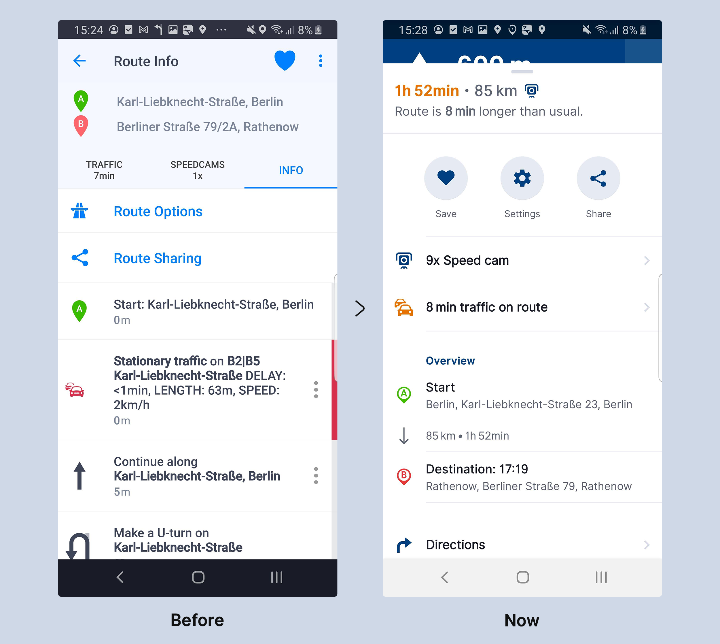
Route detail is now re-arranged, containing more information in a transparent layout. You can find even more specifications on distance and duration for each passing point and on a secondary level to each route item.
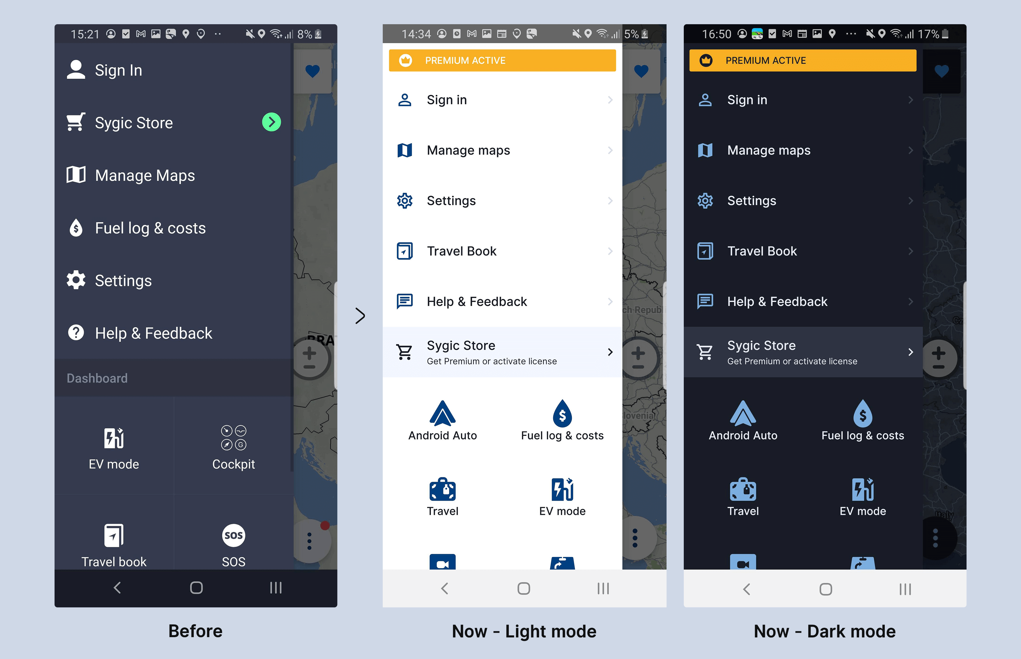
All menus in the Sygic GPS Navigation app are now unified in colour and design and the entire app has its light and dark mode. Android Auto icon is a new item in the main menu.
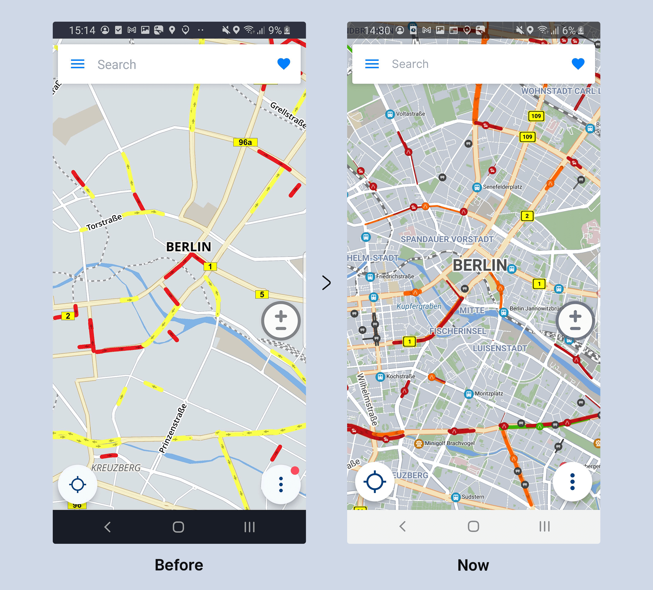
City maps got new and more detailed design even in higher zoom level, while the map size is comparable to the old version. You don't need to zoom the area to see by-roads and green areas. Specific traffic and route maintenance information on the map are now more readable thanks to added icons.
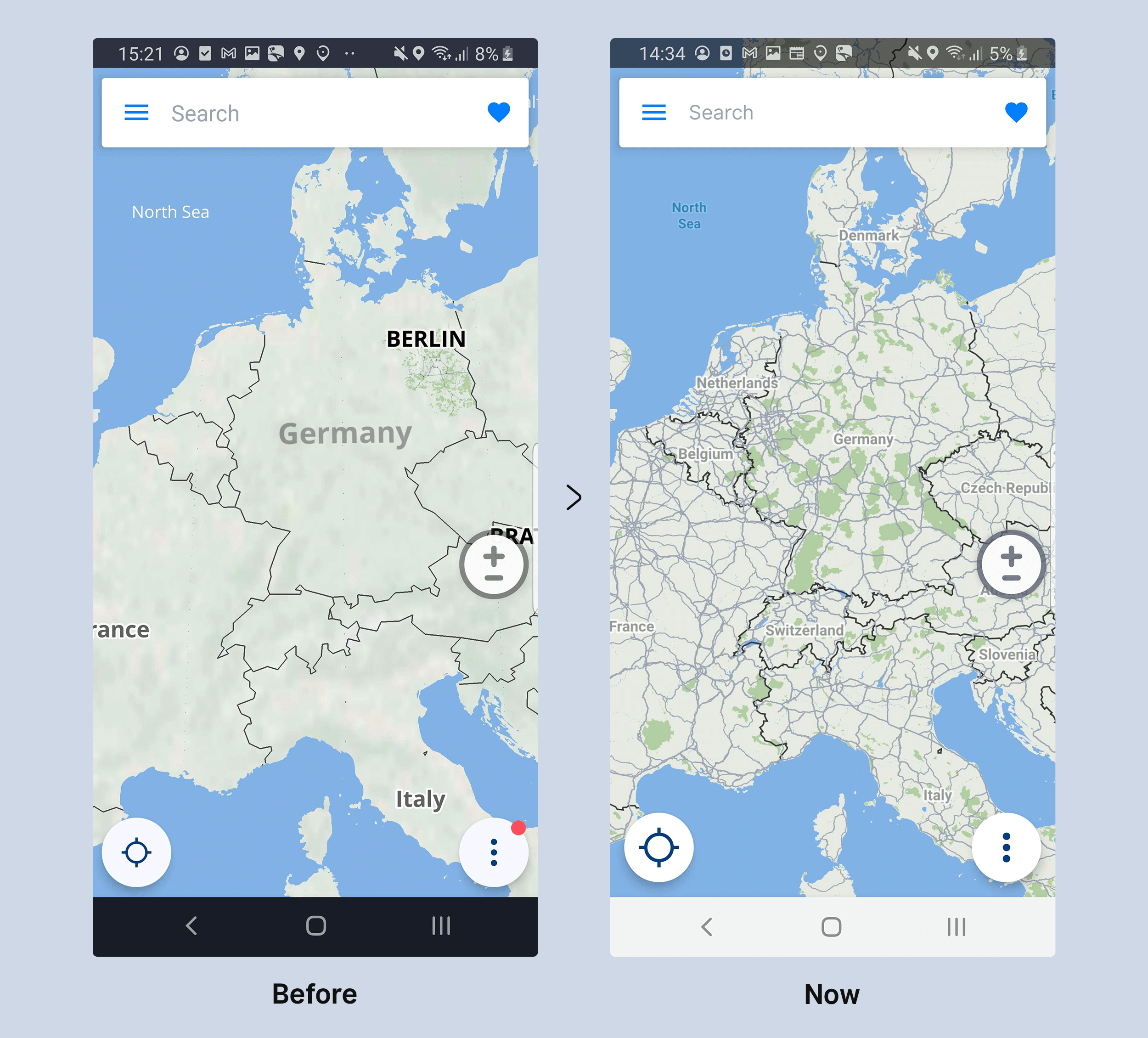
When user has downloaded only a map of a city, he/ she still can see a map of a whole country and respective region as well, including countries' names, networks of highways and green forrest areas.
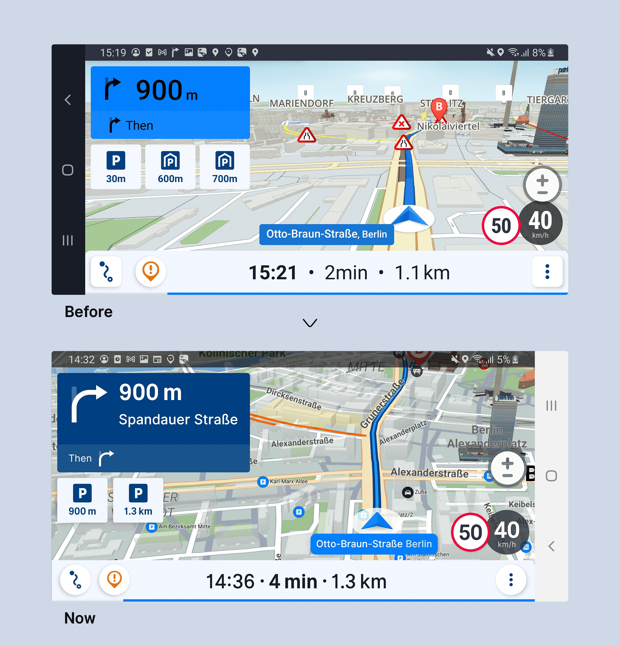
Users now can see the map from a bird's eye perspective providing better route overview, including preferred POIs on route. Arrangement of signs and texts is changed for better visibility.
Still not enough? The update enables further technology innovations in the Sygic GPS Navigation and helps to get them to the users faster. Sygic's mobile software development kit was already used in B2B solutions for insurance and telematics projects.
